 The Sensitivity Graph tool is designed to allow you to review the results of sensitivity simulations. This tool also maintains much of the flexibility and power of the Strip Graph tool to aid in model analysis. When sensitivity results have been stored for a variable, the Sensitivity Graph will show confidence bounds or multiple traces. When results are not available, it will display a graph just as the Strip Graph tool would. You can display multiple simulations (though only one sensitivity simulation) and overlay data and simulation experiments on sensitivity results.
Sensitivity Graph Options
You can set the Sensitivity Graph to show confidence bounds or individual traces, and set the colors and values for the confidence bounds. You can also set a number of options that are the same as for the Strip Graph and the discussion of those will not be repeated here.
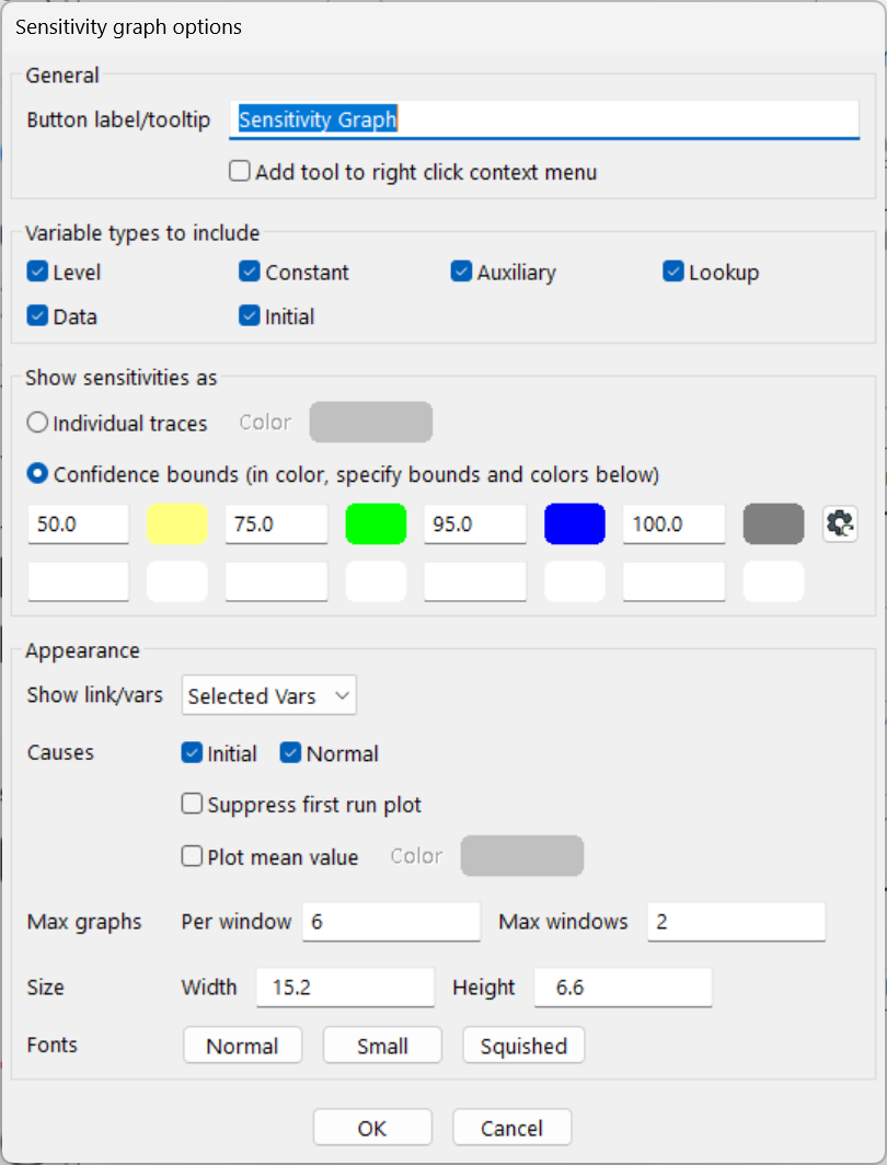
Show Sensitivities as:
| • Individual Traces, if checked, will cause a thin line to be displayed for every sensitivity simulation performed. You can set the color of all of the individual traces with the Color button to the right. Because of memory limitations, some configurations of Vensim might restrict the actual number of traces displayed (generally to about 100). The use of individual traces is probably appropriate when you are making only a handful of simulations. |
| • | Confidence Bounds, if checked, causes the simulations results to be displayed as confidence bounds. These are computed at each point in time by ordering and sampling all the simulation runs. Thus, for example, for a confidence bound at 50, 1/4 of the runs will have a value bigger than the top of the confidence bound and 1/4 will have a value lower than the bottom. You can enter up to 8 confidence bound regions (in any order) and the color that should be used to display them. Simply type in a number and click to select a color. |
Plot Mean Value, if checked, causes the mean value at each point in time to be displayed. In general the mean value will not be the same as the median value (middle of the confidence region) or the base simulation run. You can set the color with which the mean value is displayed by clicking on the color button to the right.
Suppress first run plot, if checked, will suppress the plot from the first run. This is often desirable if you are choosing to plot the mean value.
Sensitivity Graph Output
To use the Sensitivity Graph tool, the first loaded run must be a sensitivity run. Computation can take several seconds or even minutes if there are a large (>500) number of simulations contained in the sensitivity run.
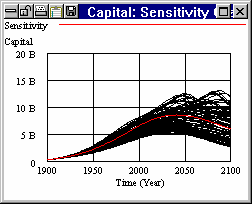
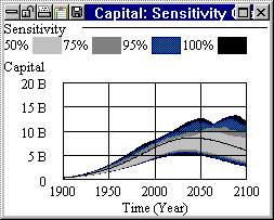
The graph on the left shows individual traces, that on the right shows confidence bounds. If you ask for the Sensitivity Graph of a Constant that has been changed in creating the runs you will get:
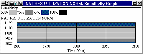
The flat confidence bands result because this is a constant.
If you ask for a Sensitivity Graph of a variable that has not been saved you will get the same output you would get for a Strip Graph.