The Graph tool displays single or multiple variables on a single graph. It is useful for getting the big picture of a number of variables, and for printing presentation-quality copies of your graphs.
When invoked from the Workbench, the Graph tool allows only one variable per graph, although there can be multiple datasets and subscript values.
Displaying multiple variables on a graph requires a Custom Graph, using the Define custom graph on invocation option (see below) or using the Graph tab of the Control Panel. You cannot do causal tracing with the Graph tool.
Graph Options
You can customize a graph's style and printed output by changing the options on the Graph tool. Right-click or Control-click on the Graph tool to get the Graph Options dialog.
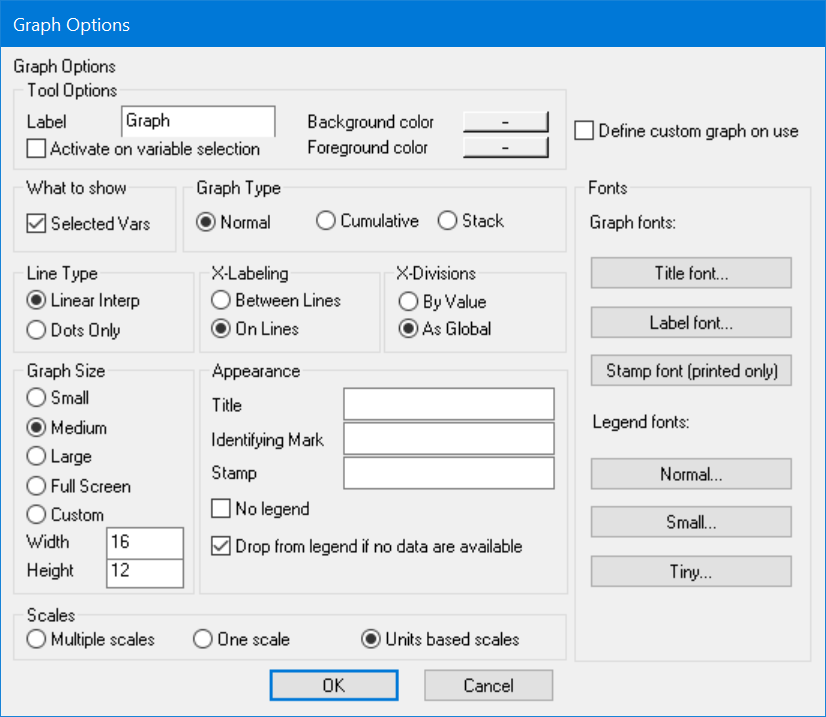
Line Type (Linear Interp or Dots Only) display plots as lines or dots.
•Linear Interpolation connects all the data points with lines. This is normally the easiest type of graph to understand quickly.
•Dots Only displays each data point as a separate dot. This is useful for reviewing data.
Graph Size (Small or Medium or Large or Full Screen or Custom) determines the initial size of the window created by the Graph tool. You can resize the Graph after it is displayed.
•Small, Medium, Large, and Full Screen create successively larger windows.
•Custom allows you to enter the initial size of the window created. Type in a width and height (in inches or centimeters according to the setting you have chosen in the Global Options dialog).
Graph Type (Normal, Cumulative, Stack) determines how data will be represented.
•Normal displays the values of the variables over time.
•Cumulative integrates the values of the variables. For positive variables, Cumulative yields an upward-sloping graph over time. The cumulation for a variable begins at the first time that values for the variable are available, regardless of the global Start time. This ensures that if you shorten the time range, the values will be the same as those in a graph of the full time range. Cumulative graphs allow you to view accumulations without adding additional model variables.
•Stack displays the values of the first variable normally, the second as the sum of the first and second variables, the third as the sum of the first three, and so on. All variables are stacked, including different subscript elements in a run and the same variable for different runs. For positive variables, this means that each successive variable is higher than its predecessors and that the final variable is the sum of all variables. An error occurs if the variables are from datasets with different sampling points (for example, different values of SAVEPER). Stack graphs are a convenient way of breaking down the components of a variable. It make the most sense to use stack graphs with one variable from multiple runs, or multiple subscripts from one run but rarely both.
X-Labeling (Between Lines, On Lines) determines the position of labels for the X-axis.
• Between Lines places the labels between the grid lines that marks values on the X-axis. This is useful if the graphed data represent activity during a period.
• On Lines places the labels on the grid lines marking the X-axis. This is useful if the graphed data represent activity at a particular time.
X-Divisions (By Value, As Global) determines the number of X-axis divisions in the graph.
• By Value sets the number of X-axis divisions to line up with round numbers.
• As Global sets the number of X-axis divisions equal to whatever is set in the Time Axis Control dialog.
Title Font lets you set the font that will be used in displaying the title of the Vensim model. Clicking on this and the other font buttons brings up the font selection dialog.
Label Font lets you select the font that will be used in the X and Y axis labels for the graph.
Stamp Fonts lets you select the fonts that will be used in printing the stamp on printed output.
Legend Fonts (Normal, Small and Tiny) let you set the fonts that will be used in the legend of the graph. The small font is used when the normal font is too big, and the tiny font is used when the small font is too big.
No legend, if checked, suppresses the legend on the graph. This will make the graph bigger and can be useful when graphing a large number of variables or datasets.
Drop from legend if no data is available, if checked, will drop any variable from the legend for which no points are being plotted. The color selection of the remaining items will be unchanged. This option is useful if you have a large number of datasets available, but each of them contains only a subset of the model variables.
Identifying Mark is text displayed at the lower left of a printed graph in a small font. This option is blank by default. If you type text here, it will be displayed on the printed graph only, not on the screen. You can use this option to make notes, indicate the source of a graph, and so on.
Stamp is placed over the lower part of the printed graph in the Overlay Font. You can use this option to mark printed graphs as confidential, preliminary, draft, or whatever is useful. The text you type here will not appear on the screen.
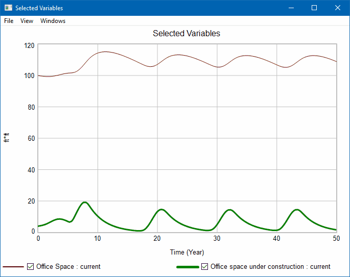
Graph Title is the title displayed on top of the graph. This option is blank by default, and if you leave it blank, the title will be variable name being graphed. If more than one variable is graphed the default title is simply "Selected Variables."
Selected Vars, if checked, displays the graph based on the variables selected on the current view, or simply using the workbench variable if nothing is selected. If Selected Vars is checked the following scaling options apply.
• Multiple scales uses a different scale for each selected variable (though different runs or subscripts will appear on the same scale).
• One scale uses a single scale for all variables selected regardless of their units. The units displayed in this case will be those of the first variable.
• Units based scales puts all variables with the same units of measure onto a common scale. This is the default. If no units are specified this and Multiple scales give the same behavior.
Define Custom Graph on Invocation, if checked, will cause the Custom Graph Editor to be opened you click on the tool. The graph definition will be filled in with the information that would have been used to create the graph. This is a convenient way to create graphs with a small amount of customization.
NOTEThe Graph Tool always uses round numbers for the minimum and maximum X values unless the range on the X-axis is less than 10.
Graph Output
When you click on the Graph tool, Vensim opens a new window containing a graph. If you try to graph more than 16 values (say four Subscripts for five runs), only the first 16 are shown. (This limitation does not apply to Custom Graphs.) Keep in mind that graphs with more than five or six lines are hard to read.
The time axis for the graph follows the global Start time and End time, but is rounded to even numbers. If the X Divisions As Global option is selected, the number of horizontal divisions is determined by the setting in the Scale tab of the Control Panel. If X Divisions By Value is selected, the number of horizontal graph divisions is based on the minimum and maximum values for the time axis, and does not derive from the Control Panel settings.
For each variable, the units are reported. When invoked from the Workbench, the Graph tool always creates a graph with a single vertical scale.
Graphs in Vensim versions 7.0 and above
Graph and Strip Graph analysis output windows have a new look and behavior as of Vensim 7.0.
Graph output supports many features to interactively adjust the graph view:
· Two-finger scrolling or mouse-wheel will zoom in and out
· Right-click dragging will pan the graph
· Zoom and pan on a graph axis will adjust only that axis
· Left-click drag to zoom to a rubberband selection
· Hovering the mouse over one of the legend entries or a line on the graph will highlight that line
· Legend has a checkbox for each entry to quickly show or hide individual lines
In addition to mouse interaction, the View menu includes:
· Copy graph to clipboard to paste into an external application
· Reset Scale will reset the graph to its original zoom
· Reset Scale is also done by left-click dragging up and left on the graph
· Toggle all lines for quick back and forth comparison
· Options to adjust the appearance of the graph
When a new graph window is created, the previous graph window (if not locked) is hidden. It can be accessed by the "Windows" graph menu. The Windows menu also gives the option to close all unlocked graph windows. A graph window can be locked through the File menu.
Graphs with multiple Y axes will show the second Y axis on the right of the graph. In the legend an asterisk denotes any lines not on one of the two shown Y axes. Each Y axis shows lines with the same units, either identical or equivalent (given by the "Units Equiv" model settings tab).
If you need to use the old output check Tools > Options > Graphics > "Use Old Graphs"