![]()
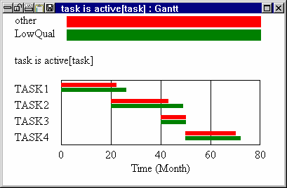
The Gantt Chart tool — designed to work primarily with project models — produces Gantt charts automatically from data and simulation results. A Gantt chart measures the Start Date and End Date of various tasks along a horizontal axis.
You can use the Gantt chart with any variable in a model, but the most common use is with project models and a variable with a name like:
| task is active[task] = IF THEN ELSE( |
| task is started[task] :AND: |
| :NOT: task is finished[task],1,0) ~~| |
To see a Gantt Chart, use the Subscript Selection dialog to select all elements of task, select the variables task is active[task] into the Workbench, and activate the Gantt Chart tool.
Gantt Chart Options
The Gantt Chart tool has options for sorting tasks and showing lapses in task activity.
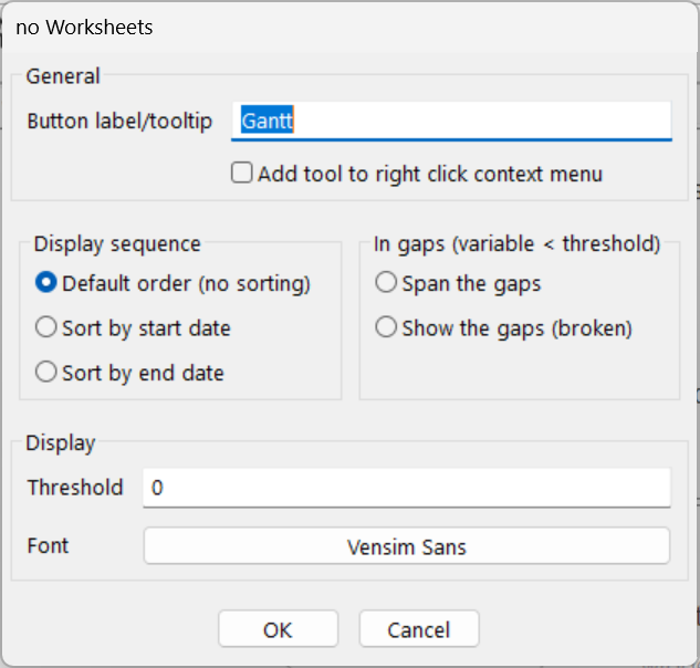
Display Sequence (Sort by Start Date or Sort by End Date or Default Order (no sorting)) specifies how the bars should be ordered.
| • | Sort by Start Date specifies that the task that began the earliest is displayed first, the second earliest second, and so on. The earliest Start Date for a task is the earliest Start Date for that task over all datasets. The resulting bars look like an inverted staircase on the left, but might be different on the right. (The appearance of sorted Gantt charts when there are multiple runs is not always what you would expect. One run (say out of 4) with outlying task start times can totally change the order.) |
| • | Sort by End Date specifies that the task that ended first is shown first, the task that ended next is shown second, and so on. The End Dates for comparison are the latest dates over all runs. The resulting bars look like a staircase on the right, but might have a different appearance on the left. |
| • | Default Order (no sorting) specifies that the bars are reported in the same order as the tasks are defined (on the right side of a Subscript Range equation). This order is often the same as Sort by Start Date, depending on model-building conventions and interruptions in the project being modeled. |
Threshold determines when the Gantt Chart should display a bar. Gantt Charts display a variable as on or off. The threshold allows you to redefine on and off to have a meaning appropriate to your needs. By default, the threshold is zero, which works fine with a variable such as task is active which is zero when the task is not active and one when it is. But if you want to see graphically when a variable is above a certain value (such as when Population exceeds 200 million), you can set the threshold to this value.
In Gaps (var < threshold) (Span the Gaps (solid), Show the Gaps (broken)) determines how task interruptions are displayed. A task interruption occurs when a variable that has been, and will again be, above the threshold goes below the threshold (var < threshold). For project models, premature victory is often declared and tasks that were thought to be completed are restarted. When this happens, showing the task as always active can be misleading.
| • Span the Gaps (solid) shows a solid bar from the first to the last time the variable was above the threshold. |
| • | Show the Gaps (broken) shows a series of bars for all periods during which the variable was above its threshold. |
Font allows you to set the output font for the Gantt Chart.
Gantt Chart Output
Each invocation of the Gantt Chart tool creates a separate output window. The X-axis in the Gantt chart is a time axis. You can select the Start Date and End Date by Shift-dragging on the axis. Separate runs are shown with differently colored bars.