The Bar Graph tool creates a bar graph of one variable at a specific time. This is useful for comparing summary measures across runs or subscripts. The Bar Graph tool can also be used for showing histograms of variables over all times, and histograms of the results from sensitivity simulations. Custom Bar Graphs can display more than one variable.
Bar Graph Options
The Bar Graph tool has options to change orientation and the times at which the bars are computed.
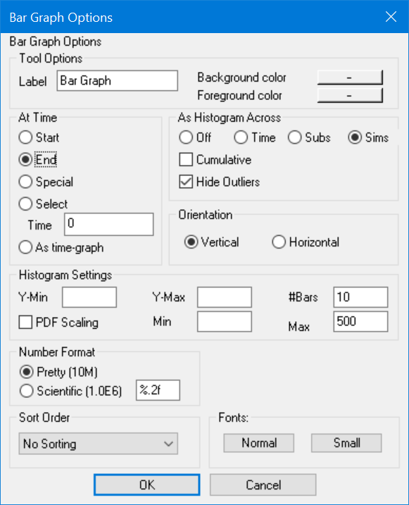
At Time (Start or End or Special or Selector As time-graph) determines what time the bars will be displayed for. Since the Bar Graph tool displays a single value of a variable, and simulation and data contain multiple values of variables, it is necessary to select a time at which to display the value.
| • | Start shows the values for variables at Start time as set in the Control Panel. |
| • | End shows the values for variables at End time as set in the Control Panel. |
| • | Special shows the values for variables at Special time as set in the Control Panel. |
| • | Select allows you to select a value for the time at which the Bar Graph tool shows values. Enter the time at which you want the bars to be displayed. This value will be interpreted in the context of the currently selected Time Base. |
| • | As time-graph shows the values from all times. This generates a time-graph in the style of the bar graph and is useful when the number of time points being reviewed is small. This option is not valid if you are creating a histogram for a sensitivity simulation. |
As Histogram Across
Off, if checked, simply presents values at a time or across time according to the At Time settings.
Time, if checked, causes a histogram of the data across time to be prepared. Histograms across time are only prepared on a single variable even if the subscript selection would indicate more than one variable to be displayed.
Subs, if checked, causes a histogram across subscripts at a given time to be displayed. This is not compatible with the As time-graph selection. If more than one subscript range has multiple selections the range will be over all possible combination of subscript values just as for the non-histogram bar graph.
Sims, if checked, causes a histogram across sensitivity runs at the specified time. Sensitivity histograms can be used to compare the results of different sensitivity simulations.
Cumulative, if checked, causes a cumulative histogram to be displayed. A cumulative histogram starts at 0 and increases monotonically to the total number of data points. It is the same as the area under the regular histogram to the left of the current point.
| • | Hide Outliers, if checked and either Y-min or Y-max is filled in, will cause any values below the specified minimum or above the specified maximum to be ignored. If hide outliers is not checked, and an exceptional value is found, a < Minimum or >Maximum category will be added. |
| • | Y-min is the minimum value used in computing the histogram. This number will determine the horizontal scale on a vertical bar graph and the vertical scale on a horizontal bar graph. |
| • | Y-max is the maximum value used in computing the histogram. This again determines the horizontal scales on a vertical bar graph. |
| • | #Bars determines how many bars will be displayed on the histogram. If you have specified a Y-min or Y-max and not checked Hide Outliers, additional bars are added for the outliers. |
| • | PDF Scaling, if checked, scales the histogram as a Probability Density Function so that the area underneath the histogram is one. This can be very useful for comparing sensitivity simulations where the number of sensitivity simulations made is different between the two simulation runs. |
| • | Min, determines the minimum value that will be displayed on the vertical axis for vertical bar graphs and the horizontal axis for horizontal bar graphs. |
| • | Max, determines the maximum value that will be displayed on the vertical axis for vertical bar graphs. |
Orientation (Vertical or Horizontal) determines whether the bars are displayed vertically or horizontally. Depending on the length of subscript names, this can influence the size of a bar graph that can fit on the screen. The Bar Graph tool icon reflects your choice.
Fonts (Normal and Small), let you set the fonts that will be used for output. The normal font is used if there is sufficient room, if not the small font is used.
Bar Graph Output
The Bar Graph tool creates a bar graph in a new window. The labels for the bars (below) are the different subscript combinations. Multiple runs are displayed side by side so that they can be compared easily. All bars have a common axis.

Histogram Output
When you have the histogram option specified you will see a histogram of values over the currently selected time range.

Note that the Y axis in the histogram is data counts, while the X axis corresponds to the values of the variable. The same graph displayed with PDF Scaling would appear as:

Bar Graphs as Graphs
If the number of variables that would appear on a Bar Graph is too big to fit on a single screen, the bar graph will be displayed using the Graph tool. If, for example, you had a project with 100 phases and you asked to see the cost of each phase, this might happen. If it does, the graph will be a dots-only graph (no lines connecting the dots). The X-axis for the graph in this example would be the different phase names.

If the X-axis for a graph is a single Subscript Range (as it is in this example), you can reselect Subscripts by Shift-clicking on the graph. For example, if you found something of interest between PHASE19 and PHASE37, you could Shift-click on the graph and select that region. If you then invoked the Bar Graph tool again, you would see a blow-up of that region. Eventually this blow-up will be a regular Bar Graph which shows you exactly what is going on for each individual phase.